Why an 11-Second Loop Beats My Hero Video
I wanted a 35-second hero video. I built an 11-second loop instead: it loads faster, never shifts the layout, and lands the whole message in eleven seconds.
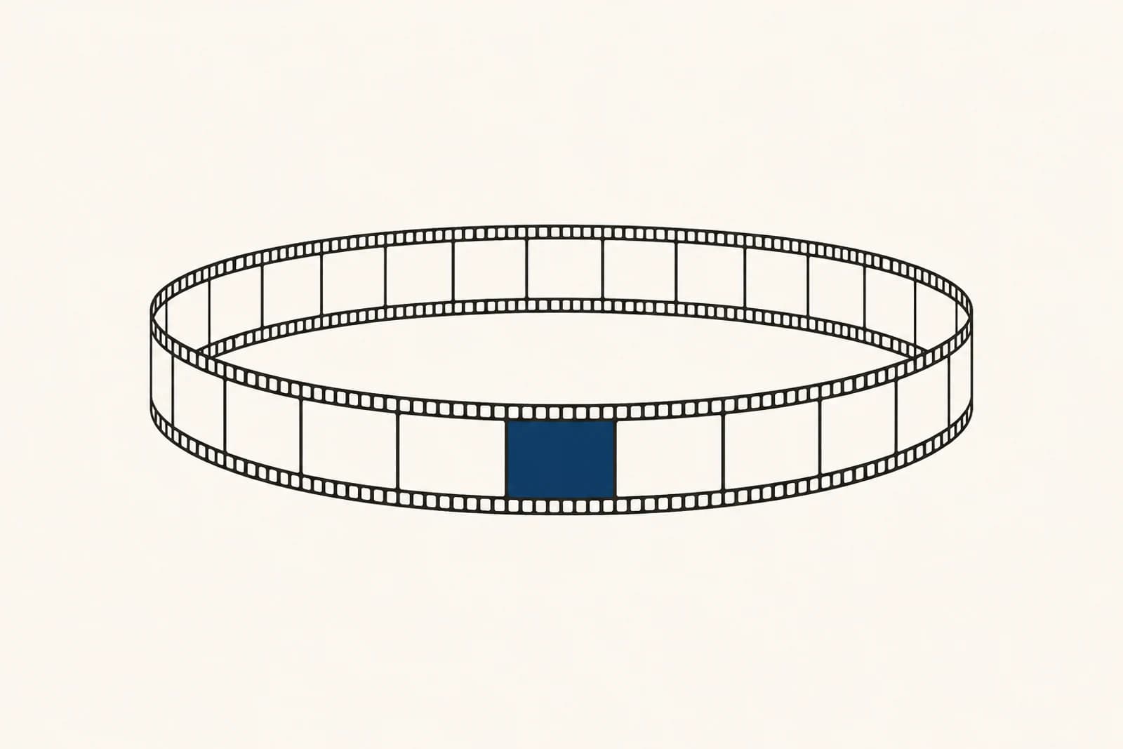
TL;DR
I wanted a 35-second hero video for my home page. What I built is an 11-second loop, and it is the better call. It loads faster, it does not make the layout jump while it arrives, and it lands the message in eleven seconds instead of stretching it across half a minute that nobody watches to the end anyway. Behind it sits a framework I wrote down once and cleanly: a seven-step pipeline that renders the video at build time and ships it as a plain file. Its first real use was live on the home page of this very site for a few weeks, until the September 2026 hero redesign replaced it with a small headshot image. This article explains why a loop is the better format and what building the first one taught me.
The Problem: Nobody Finishes a 35-Second Film
The first plan was an actual video. A roughly 35-second intro explaining my offer: I build your prototype with you, in short sprints, and at the end your production system stays yours and your team can take over. A nice idea on paper. In practice it has three hard edges, and each one on its own was reason enough to drop it.
The first edge is attention. A home page does not have 35 seconds. It has maybe three, before someone scrolls on or bounces back into the search results. A film that needs half a minute to make its point never makes it for most visitors, because they are long gone. The second edge is weight. A cleanly rendered 35-second video runs to several megabytes fast, and you push exactly that onto a mobile connection at the precise moment the first impression forms. The third edge is sound. A narrated video wants a voice-over or music, and on a home page both either play unprompted or not at all, and both are wrong.
So I turned the question around. Not "how do I tell my offer in 35 seconds?" but "what is the smallest moving image that carries the message?" The answer was not a film. It was a loop.
Why a Loop and Not a Video
A loop is not a shrunken video. It is a different format with different rules, and those rules are exactly what make it better for the first screen. Four reasons decided it:
- Attention, not patience. A loop asks for no time that nobody has. It shows one closed motion in a few seconds and repeats it. Someone who only glances has still seen the whole thought. Someone who lingers sees it a second time, with nothing missing.
- Lightweight, not ballast. Eleven silent seconds fit inside a budget a narrated film never keeps: around 80 kilobytes as MP4, roughly 116 kilobytes as WebM, plus a still image of a few kilobytes that shows up instantly. That loads on a phone before anyone gets impatient.
- Calm, not a layout jump. Motion on a home page has a notorious side effect: if the video loads later than the text, the layout jumps, and the headline you were about to read slides away. Cumulative Layout Shift is the technical name, and it is one of the numbers Google grades a page on. A loop with a fixed frame and a poster as its placeholder lets nothing jump.
- No sound, no play button. A loop runs silent and automatic. No "play", no surprise music, no controls. It is simply there, like an image that breathes.
The message this loop carries is the same one the film plan had, just condensed into four quiet motions: a sketch draws the process and marks the single gap that needs closing. Terminal lines type themselves, blocks assemble, test dots turn green. A second cursor takes over from the first, a documentation checklist fills in. And at the end the system travels to the client's side, the building cursor fades out, the system keeps pulsing calmly. That is the hand-off story my way of working tells too, in eleven seconds, without a single word of voice-over.
The Framework: Seven Steps, Written Down Once
The loop was not built as a one-off. It is the first use of a framework I wrote down for product videos across several projects. The same preference for video work that happens at build time rather than in the browser also drives the agent that cuts my talks. The core in one sentence: the video is rendered once at build time, the finished files are checked in with the code, and the page ships them as a plain <video> element. No player in the browser, no render library in the page bundle. The pipeline has seven steps, grouped here into four stages:
- Brief and beat script. First the core is fixed: which chain gets shown, for whom, with which claims allowed. From that come four beats of about 2.75 seconds each, eleven seconds at 330 frames. Captions are at most six words and word-for-word identical to approved copy. My sign-off comes before the build, not after.
- Colors and font as fixed values. The renderer runs a headless Chromium, and that knows nothing about the site's CSS variables. So every brand color is stored as an exact hex value, each with a comment on where it came from. This is exactly where the font lesson lives, which I get to in a moment.
- One composition, several formats. A single component from which 16:9, 4:5, and 1:1 fall out, distinguished only by a format property. German and English run through one language property, not through copies. The last roughly twelve frames fade back to the opening state, so the loop closes without a visible cut.
- Render, embed, measure. Rendering happens locally, embedding as a silent auto-loop video with a poster and a static image for anyone who has reduced motion set: they get zero video bytes. At the end an analytics event sits next to the embed, so that after a few weeks I can see whether it did anything.
I am deliberately keeping the Remotion details short, because they are not the point. The point is the discipline behind them: the tool builds the video, it never runs along in the browser. A dedicated test keeps watch that no render library accidentally wanders back into the page bundle. That strictness was paid for the hard way: on another project, an early attempt hung for days with un-rendered assets, because the render environment had never been verified. The second attempt worked precisely because building and shipping stayed separate.
What Building It Taught Me
A framework on paper is one thing; the first real build is another. Three lessons stuck while I built the home loop:
- The font has to be the real one, and it is Albert Sans. The first render looked subtly wrong, and it took me a while to see why: the headless Chromium has no website font installed and quietly falls back to a system typeface. So the real font must be loaded at render time. Slightly embarrassing footnote: an older note in my head still said "DM Sans". The font the site actually ships is Albert Sans. The loop only looked right once it loaded that exact font, not the one I thought I remembered.
- Colors lie unless you nail them down. Because the renderer does not know the page's CSS variables, every color has to be present as a concrete hex value: the off-black of the background, the off-white of the text, the single Wien-Rot accent. I gave each of these numbers a source note, so it cannot quietly drift away from the site over time. A video whose red differs from the website red stands out immediately, and not pleasantly.
- The poster is not the first frame. The placeholder that appears before the video is deliberately the loop's opening state, the very one the loop fades back to at the end. That way there is no hard cut between still image and running video, and the repetition closes cleanly on itself.
A loop is not a smaller video. It is a different question: not "how do I tell everything?" but "what is the smallest moving image that carries the message?"
From Framework to the First Real Surface: The Home Page, Back Then
Let me state this without inflation: it was a framework and its first real use, not a system rolled out everywhere. Exactly one surface used the loop in production, and that was the home page of this site, until the September 2026 hero redesign replaced it with a small headshot image. Everything else, including card mini-loops and more product pages, stayed on a list and never went into service.
But what the one surface showed is exactly the standard I stand for: the process first, then the result. The loop explained, in eleven seconds, the same hand-off idea that carries my whole offer, and it did so at a weight that did not hurt the page's load time. The first screen stayed fast, the headline did not slide away, and anyone with reduced motion set saw a calm still image instead of a video they never wanted.
The nicest side effect is reuse. Because the same component covers three formats and two languages, the ingredients for a portrait fragment for social or an English variant already sit there, ready. I did not build one video; I built a small video factory with a single product that stayed in service until the redesign, and the rest remains a switch, not a rebuild.
Conclusion
What matters about this loop is not the technology, but the decision behind it:
- Format follows attention, not ambition. Eleven seconds that land beat 35 seconds nobody finishes. The message arrives because it is short.
- Rendered at build time, shipped as a file. No player in the browser, a fixed frame against the layout jump, a still image for reduced motion. Speed here is a feature, not an accident.
- The scope stayed small. The home page was the first and only live surface until the September 2026 hero redesign replaced the loop with a headshot image.
- AI is a tool here too: it renders fast, it does not decide. A good loop does not fall out of one click; it comes out of a process and out of the small lessons you pay for on the first real build. If you want something like this for your product, contact is the direct route.